

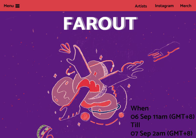


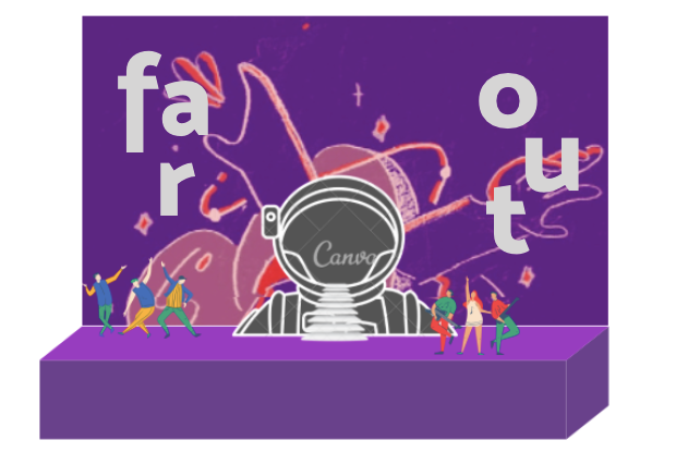

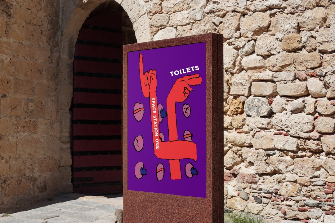


1. What is the main focal point of your collaterals and how do you display that? (One explanation for each collateral)
The main focal points on our collaterals are the “mosk” fonts, hands, colors and shapes/elements that were based on the original key art. The “mosk” font is used in all the collaterals for example, the main title that is “Far Out”. As you can see, on the websites and instagram page uses the hierarchy of the font as the focal point in order to balance out with the size of key art. Also, on the instagram like page shows the artist’s appearance and shows that shadowy/fading effect on the background to give it contrast to make it more stand out. Moreover, we added the astronaut on some of the collaterals like the poster, stage, badges, and stickers because the theme is based on space and gives that kinda cool spacey vibe to it.
Basically, the colors used on the collaterals are based on the color palette and also on the typefaces so it balances each other. We played around with the colors so it balances out when combining with different types of shapes and elements. For example, the purple color is used for the background mostly on all the collaterals and added some other elements into it like planets so it fills up all the empty spaces. The designs on the original key art have rough lines and textures that we also incorporated on the collaterals. However, the use of the hands are displayed and placed in different ways (not too complicated) based on its functions on all the collaterals. The hands are portrayed to give that entertaining look because it is a music festival after all. It also gives that playful and dynamic feeling to it.
2. What is the order of importance for the items of your collaterals (the information, the graphics, the titles, etc.) and how did you display that? (One explanation for each collateral)
The order of importance on all the collaterals starts with the hierarchy of the texts. It shows the important details like the main title, the headlining artists, date and time, and information about the festival. Then on some of the collaterals, after the text is the graphics of the festival. It does not just show our key art but also other elements that were added to make it more fun and attract the viewers attention. As you can see, the colors also play its role on all the collaterals so it balances out with the elements and texts that are also incorporated. The hands are also the most important feature with adding some space elements into the collaterals because it symbolizes the festival’s theme that is “Far Out”.


